How Can Tailors Use Color Theory to Elevate Their Custom Designs?

- How Can Tailors Use Color Theory to Elevate Their Custom Designs?
- Understanding the Basics of Color Theory
- Applying Color Theory to Custom Tailoring
- Customizing for Client Preferences
- Mastering the Use of Color in Patterns and Textures
- Practical Tips for Implementing Color Theory
- Summary Table
-
FAQ
- 1. How does color theory influence custom tailoring designs?
- 2. What are complementary colors and how are they used in tailoring?
- 3. How can I create a balanced color palette for a tailoring collection?
- 4. What role do seasonal colors play in tailoring?
- 5. How can tailors customize color choices for individual clients?
- 6. What is the impact of color on fabric texture in tailoring?
- 7. How can tailors effectively test and adjust color choices before finalizing a design?
- Conclusion
How Can Tailors Use Color Theory to Elevate Their Custom Designs?
In the world of tailoring, the application of color theory is a powerful tool that can significantly enhance the impact of custom designs. Understanding and utilizing color principles not only elevates the visual appeal of garments but also helps tailors create pieces that resonate with their clients' personal styles and preferences. This article explores how tailors can effectively use color theory to refine their custom designs and achieve remarkable results.
Understanding the Basics of Color Theory
The Color Wheel and Color Relationships
At the core of color theory is the color wheel, a tool that illustrates how colors interact with one another. It consists of primary colors (red, blue, yellow), secondary colors (green, orange, purple), and tertiary colors. Key relationships include:
- Complementary Colors: Colors located opposite each other on the wheel, such as blue and orange, create vibrant contrasts when paired.
- Analogous Colors: Colors adjacent to each other on the wheel, like blue, blue-green, and green, offer harmonious and cohesive looks.
- Triadic Colors: Three colors evenly spaced around the wheel, such as red, yellow, and blue, provide a balanced and dynamic palette.
The Psychological Impact of Colors
Colors evoke emotions and influence perceptions. Understanding the psychological effects of colors helps tailor designs that align with the desired mood or message. For instance:
- Blue conveys calmness and professionalism.
- Red represents passion and energy.
- Green symbolizes balance and freshness.
Using these associations strategically can enhance the overall impact of a design.
Applying Color Theory to Custom Tailoring
Creating a Balanced Palette
When designing custom garments, creating a balanced color palette is crucial. Start by selecting a base color, which will dominate the design. This can be a classic shade like navy or charcoal gray. Then, choose accent colors to add contrast and interest. Ensure these accents complement the base color while providing a pleasing visual balance.
Incorporating Color Harmony
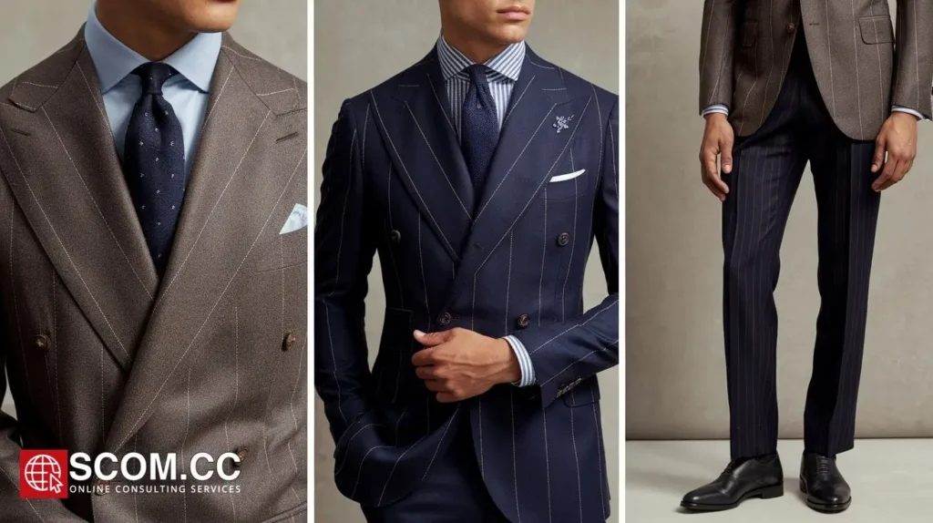
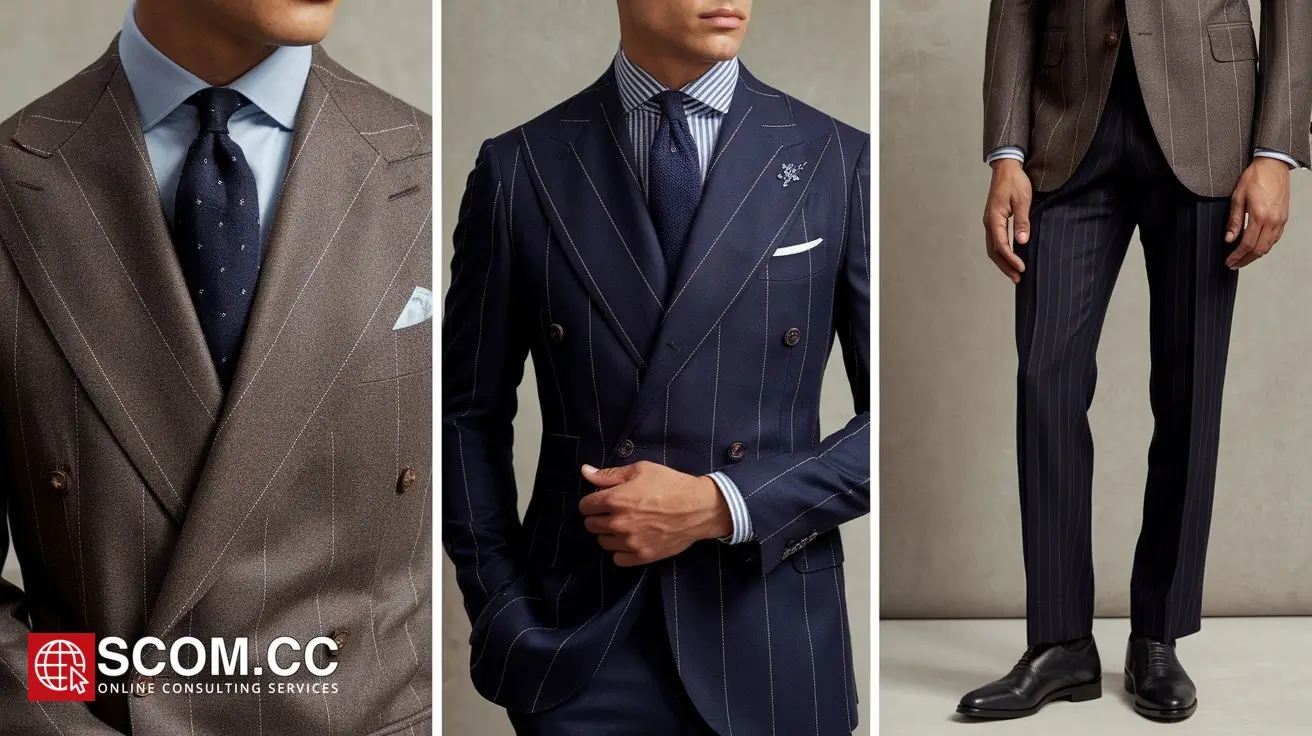
Incorporate color harmony to achieve a cohesive look. For instance, if designing a suit, use analogous colors for a sophisticated and unified appearance. A gray suit with light blue and navy accents creates a harmonious and stylish ensemble. Conversely, complementary colors can be used for bolder, attention-grabbing designs. A blue suit with orange accessories makes a strong statement.
Utilizing Seasonal and Trend Colors
Incorporate seasonal colors to keep designs current and relevant. Each season has its own color trends, influenced by fashion shows, industry reports, and cultural shifts. Spring might feature soft pastels, while fall emphasizes rich earth tones. By staying updated with color trends, tailors can offer designs that resonate with contemporary aesthetics.
Customizing for Client Preferences
Personalizing Color Choices
Tailors should consider individual client preferences when applying color theory. Engage in discussions to understand their color preferences and lifestyle needs. For example, a client who prefers a classic style might lean towards neutral colors, while someone with a bold personality might favor vibrant hues. Personalizing color choices ensures that the final design aligns with the client’s vision.
Enhancing Client Features
Color theory can also be used to enhance a client’s personal features. For instance:
- Skin Tone: Colors that complement the client’s skin tone can enhance their appearance. Warm tones like earthy browns and deep reds are often flattering for warmer skin tones, while cool tones like blue and gray suit cooler skin tones.
- Hair and Eye Color: Colors that contrast with or complement the client’s hair and eye color can make a design more striking. For example, a client with dark hair might look exceptional in deep jewel tones.
Mastering the Use of Color in Patterns and Textures
Balancing Color in Patterns
When working with patterns, such as stripes, checks, or floral designs, use color theory to ensure they complement rather than clash. Monochromatic patterns use variations of a single color, while polka dots or geometric patterns can incorporate multiple colors for a more dynamic look. Ensure that patterns are cohesive with the overall color scheme of the garment.
Enhancing Texture with Color
Color can also impact the perception of texture. For instance, darker colors tend to make fabrics appear denser and heavier, while lighter colors can make them seem more airy and fluid. Use color strategically to enhance the texture and drape of the fabric, ensuring it aligns with the intended design and functionality.
Practical Tips for Implementing Color Theory
Start with a Color Palette
Begin the design process by selecting a color palette that reflects the desired aesthetic. Use color swatches and digital tools to visualize how different colors interact. This helps in making informed decisions about which colors work best together and how they will appear in the final garment.
Test and Adjust
Before finalizing the design, create color samples or mock-ups to test how colors look together in actual fabrics. Make adjustments as needed based on how the colors appear in different lighting conditions and on different materials.
Seek Feedback
Gather feedback from clients or colleagues to ensure the color choices align with the intended vision and appeal. Constructive feedback can provide valuable insights and help refine the final design.
Summary Table
| Aspect | Key Points |
|---|---|
| Basics of Color Theory | - Color Wheel: Primary, secondary, and tertiary colors. - Color Relationships: Complementary, analogous, triadic. - Psychological Impact: Emotional effects of colors. |
| Applying Color Theory | - Balanced Palette: Base color with accent colors. - Color Harmony: Analogous and complementary color schemes. - Seasonal and Trend Colors: Aligning with current fashion trends. |
| Customizing for Client Preferences | - Personal Preferences: Tailoring colors to client’s style and needs. - Enhancing Features: Colors that complement skin tone, hair, and eye color. |
| Patterns and Textures | - Balancing Patterns: Harmonizing colors in patterns. - Texture Impact: Using color to influence the perception of texture. |
| Practical Tips | - Color Palette: Select and visualize color schemes. - Test and Adjust: Create samples to test color interactions. - Seek Feedback: Gather insights for refinement. |
FAQ
1. How does color theory influence custom tailoring designs?
Color theory helps tailor designs by guiding the use of color relationships, psychological effects, and seasonal trends to create visually appealing and cohesive garments. It ensures that colors complement each other and align with the client's preferences and style.
2. What are complementary colors and how are they used in tailoring?
Complementary colors are those located opposite each other on the color wheel, such as blue and orange. In tailoring, these colors create vibrant contrasts and can be used to highlight certain elements or make bold statements in custom designs.
3. How can I create a balanced color palette for a tailoring collection?
Start with a base color and choose accent colors that complement it. Ensure that the colors work harmoniously together, creating a balanced and visually pleasing palette. Use tools like color swatches and digital software to visualize and adjust the palette.
4. What role do seasonal colors play in tailoring?
Seasonal colors reflect current fashion trends and can make designs appear more relevant and up-to-date. For example, lighter pastels are popular in spring, while rich, earthy tones are favored in fall. Incorporating these colors can enhance the appeal of custom designs.
5. How can tailors customize color choices for individual clients?
Tailors can customize colors by discussing clients' preferences and considering their lifestyle and personal style. Additionally, colors should be chosen to complement the client's skin tone, hair color, and eye color for a more personalized and flattering look.
6. What is the impact of color on fabric texture in tailoring?
Color can influence the perceived texture of a fabric. Darker colors may make fabrics appear denser, while lighter colors can make them seem more fluid. Tailors can use this knowledge to enhance the visual effect of the garment’s texture and drape.
7. How can tailors effectively test and adjust color choices before finalizing a design?
Tailors can create color samples or mock-ups to test how different colors interact with each other and how they appear on various fabrics. This allows for adjustments based on how the colors look in different lighting conditions and ensures the final design meets expectations.
Conclusion
Utilizing color theory in custom tailoring allows designers to elevate their creations by enhancing visual appeal, expressing brand identity, and aligning with client preferences. By understanding and applying color principles effectively, tailors can create garments that not only look aesthetically pleasing but also resonate deeply with their clients. Embrace the power of color to transform designs and make a lasting impression.

To explore more about tailoring, visit our Blog of Tailoring. If you have any questions or need assistance, go to our contact page. Additionally, you can find more information about tailoring and consulting at this tailoring and consulting portal.

Leave a Reply